
The first jobs number you see every month is built on 60.4% of the survey responses. The final one uses 90.9%. Everything in between — the market reaction, the Fed commentary, the “the labour market is holding up” takes — happens in that 30-point gap.
This morning, two things land within hours of each other. Fed Chair Kevin Warsh gives the first Jackson Hole keynote of his chairmanship. And at 10:00 a.m. ET, the Bureau of Labor Statistics publishes its preliminary estimate of the annual benchmark revision — the once-a-year moment when the payroll data gets checked against actual tax records instead of a survey.
Everyone is watching the first event. The second one is the one that tells you whether the last twelve months of economic narrative was real.
How the headline jobs number is actually made
The monthly payroll figure comes from the Current Employment Statistics survey — a sample of employers who report their headcount. Not all of them report on time. In 2024, the average collection rate at the first preliminary estimate was 60.4%. By the second estimate a month later it rose to 89.0%, and by the third and final estimate to 90.9%.

This isn’t a scandal and it isn’t incompetence. It’s a design trade-off: the BLS could publish a far more accurate number if it waited two extra months, but a two-month-old labour reading is useless for policy. So it publishes fast and corrects later. The problem isn’t the method. The problem is that markets and central bankers treat the fast number as if it were the accurate one, and almost nobody goes back to check.
In 2026, the revisions have gone one way
Random noise cuts both ways. What’s happened this year hasn’t looked random.
In the July Employment Situation report, May payrolls were revised down by 66,000 — from +129,000 to +63,000. June was revised down by 37,000, from +57,000 to +20,000. Combined, employment in those two months was 103,000 lower than first reported. July itself printed −23,000, against a consensus expecting +83,000, with government payrolls down 53,000 and private payrolls up just 30,000.
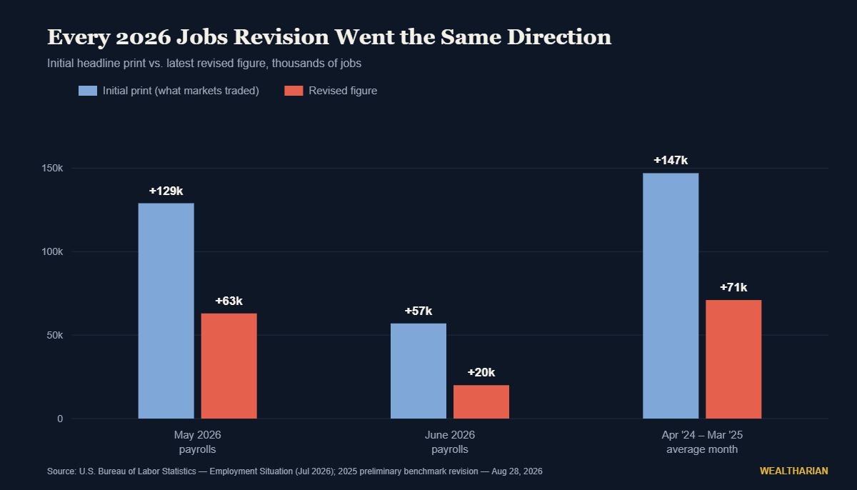
Each of those downgrades arrived weeks after the original print had already moved bond yields, repriced rate expectations and generated a round of confident commentary. The correction never gets the same airtime as the headline.
911,000: what happened the last time we benchmarked
Monthly revisions are small change compared with the annual benchmark. Once a year, BLS reconciles the survey against the Quarterly Census of Employment and Wages, which covers roughly 95% of US jobs from actual unemployment-insurance tax filings. It is as close to a headcount as the statistical system gets.
Last September’s preliminary benchmark revised total nonfarm employment for March 2025 down by 911,000 jobs — about 0.6% of total employment. Private payrolls took 880,000 of it; government 31,000. In plain terms, average monthly job creation over that year fell from a reported 147,000 to roughly 71,000. Less than half.
Think about what was decided on the strength of the original figure. Rate paths. Recession calls that never happened and recession calls that were dismissed too early. Positioning. An entire year of “the labour market is resilient” was, on the better data, a labour market running at half the assumed pace.
Why this year the direction of the error matters more
In 2024 and 2025, overstated payrolls made the Fed look slower to cut than the economy warranted. The error had a familiar shape.
2026 inverts it. Core PCE is running at 3.3% year over year, with the July print up 0.2% on the month. Roughly half the FOMC pencilled in hikes for 2026 at Warsh’s first meeting in June, and three regional Fed presidents dissented in favour of immediate tightening in July. Markets put roughly one-in-three odds on a September hike. The 10-year sits near 4.6% after a week of Jackson Hole positioning — a story we looked at in why falling oil prices stopped pulling yields down with them.
Here’s the asymmetry. If payrolls are again being overstated at the moment of publication, then the labour market that appears strong enough to tolerate a rate hike may not be. The Fed would be tightening into a job market that is materially weaker than the data it is reading — and it would only find out in February, when the final benchmark lands. Add the structural pressure we covered in AI layoffs and the quiet transfer from paychecks to portfolios, and the case for treating “the labour market is fine” as a settled fact gets thinner.
To be fair to the other side: benchmark revisions have historically been small, the QCEW itself gets revised, and one bad year of survey response doesn’t prove a trend. The point isn’t that the data is fake. It’s that the error bars are much wider than the confidence with which the number is discussed.
What this actually means for your money
The useful conclusion is not “ignore the data.” It’s to stop building positions that require the first print to be right.
1. Stop trading the print; start trading the revision pattern. If you must react to payroll day, react to the direction of the last three revisions, not the headline. In 2026 that direction has been consistently down. That’s a more informative signal than any single release.
2. Size positions to survive being wrong about the macro. The honest version of macro investing is that you don’t know what the labour market is doing right now — nobody does, including the Fed. A portfolio that only works if rates go one direction isn’t a thesis, it’s a bet. Build one that’s merely inconvenienced by the other outcome.
3. Treat cash as a position, not a parking spot. With policy genuinely two-sided for the first time in years, the option value of cash is real. But it only pays if it’s actually earning — most savers are leaving nearly all of that yield on the table, as we broke down in where to put your cash in 2026.
4. Watch your own labour market, not the national one. The single figure that matters most to your net worth over the next two years is your own income security, and it is not correlated to a national average that gets rewritten twice. Sector, employer balance sheet, and how automatable your role is will tell you more than any BLS release.
The number to watch next
Today’s preliminary benchmark is the tell. A small revision means the survey is holding up and the “strong enough to hike” framing has a foundation. Another large downward revision means the Fed spent a year debating inflation while the labour side of its mandate was quietly deteriorating beneath data it couldn’t see.
Then compare it with whatever Warsh says a few hours earlier. If the keynote projects confidence about labour-market strength and the benchmark lands heavily negative, you’ll have learned something important about how much precision to assign to Fed guidance — and how much to your own certainty.
The market’s reaction function is far more predictable than the data it reacts to. Build accordingly.
Want to track your own path to financial independence? The Wealtharian Wealth Tracker lets you monitor your net worth, FU money progress, and investment milestones in one place. Try it free →